
|
Main /
ElementsAboutLayoutThis page deals with the way that the Java software sets up the user interface; the view. In creating a view a lot of detail is not specified at all; the Java software is equipped to take care of all the details. What the software needs as guidance is the tree structure, and for each branch of the tree the layout properties.
Because the process is highly automated you don't need to specify sizes in pixels for view elements. In fact, if you do specify a size chances are it will be ignored. Specifying size in pixels is necessary only for top level windows. The advantage is flexibility. When a simulation is created as Java application the window is resizable (unless the simulation creator has set that property to 'false'). If the positions of all elements would be specified in absolute pixels then the enlarged window would look very awkward. The layout policies allow the software to redistribute the available space in a natural way. Even when Java provides a great deal of layout policies (and allows the programmer to create new ones), we will only use the following layouts:
Overview: Border layout  Border layout with all four "bordering" panels In Java the five options are referred to as Center, North, East, South, West; in EJS the five options are referred to as Center, Up, Right, Down, Left, respectively. None of the five panels is mandatory, all combinations of subsets are valid. When all five panels are declared the layout will consist of two nested boxes: a vertical stack, with a Left/Center/Right row in between. Border layout is designed to fill the available space, and to maintain that state when the outer dimensions change. The Up and Down panel receive only the vertical space they need, the remainder is allocated to the middle section. Horizontally, the Up and Down panel are expanded to the width of the outer dimension (overruling any width setting of their contents). In the middle section, the Left and Right panel get the horizontal space they need, the remainder is allocated to the Center panel. 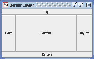 Rearranged layout when the end user has stretched the window The image shows what happens when the application window is stretched vertically. The Up and Down panel do not get more vertical space, as they already have enough; the extra vertical space is allocated to the Left/Center/Right panel. Note: The default setting of the 'Resizable' property of the parent container Frame element is 'true', in which case the end user can resize the window by dragging the edge with the mouse. The purpose of the layout policy is to maintain a consistent layout over a range of window sizes.  Layout of a subset of the bordering panels The image shows how the arrangement comes out for a subset of the five panels. As mentioned earlier, all subset combinations of the panels are valid. In each case the child elements are expanded to fill the available space. (Remark: the layout rendering does accept it when none of the child elements has Center position, but then the child elements may not be expanded to fill all available space. Border layout rendering is designed to always have a Center element to work with.) HBOX layout 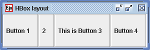 HBOX layout In rendering HBOX layout each child is first allocated the minimum space it needs (if available), then any remaining space is distributed evenly among the child elements. VBOX layout 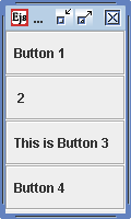 VBOX layout VBOX is the vertical counterpart of HBOX. In the picture the child elements happen to need the same amount of vertical space, so they've come out equal in size. Grid layout  Grid layout With Grid layout the available space is allocated evenly between the cells. Note that a Grid layout with a single row is the same as an HBOX layout, except that with Grid layout the child elements will all have the same size. Flow layout  Flow layout  Automatic reflow when the window is stretched Flow layout will arrange the child elements much like the words on a line; individual widths are preserved and the group of elements can be left, right or center justified. In EJS flow layout is suitable when enough horizontal space for all child elements is guaranteed. If not enough space is available flow layout will flow the child elements, much in the way words are arranged in a paragraph; when the line is filled a new line is started. General remarks The examples above all involved subdivisions of the main EJS frame, but it applies for any subpanel. When a new subpanel is created in the tree of view elements the default layout policy that EJS offers is border layout. In the cases of Border, Grid, and Flow layout it is also possible to enter values for horizontal and vertical separation between the child elements. Nesting The EJS view is created by nesting panels, each with suitable layout, in such a way that the combined effects produce the desired user interface. |